
The Project
CycleCare envisions a world where cyclists effortlessly maintain and optimize the performance of their bicycles. With a user-friendly interface and powerful features, our app simplifies the tracking and management of bicycle maintenance tasks. By offering flexible reminder customization, easy access to reliable resources, and an intuitive interface, CycleCare empowers cyclists of all levels to enjoy a seamless and enjoyable biking experience. Our goal is to enhance the longevity and performance of bicycles while ensuring that cyclists can focus on what they love most – riding.
Challenges
1. Maintenance Tracking Complexity: Simplifying the process of tracking and managing bicycle maintenance tasks, including service intervals and component-specific requirements.
2. Reminder Customization: Offering flexible customization options for maintenance reminders based on mileage or time preferences, ensuring timely notifications for servicing, part replacements, and routine inspections.
3. Resource Accessibility: Providing easy access to a comprehensive library of reliable information, including guides, videos, and tutorials, to empower cyclists with accurate resources for bike maintenance and repairs.
4. User-Friendly Interface: Designing an intuitive and user-friendly interface that is easy to navigate, allowing cyclists of all technical backgrounds to input data, schedule reminders, and access relevant information effortlessly.
1. Empathize
As a UX designer, it's crucial to understand the needs and desires of our potential users to create a successful product. Empathy is the key to designing a product that is intuitive, user-friendly, and ultimately meets the needs of our target audience. In this phase, we will focus on understanding the perspectives, experiences, and pain points of people who maintain their bicycles regularly. By developing a deeper understanding of our users' needs, we can create a design that is both meaningful and intuitive, ultimately increasing the chances of long-term user engagement. So let's get started by exploring the thoughts, feelings, and behaviours of our target users!
Research Goals:
1. I aim to identify intuitive and meaningful ways to integrate this app into users' lives.
2. I seek to understand the pain points and barriers that users may encounter when using the product, in order to design a more user-friendly and effective experience.
3. I want to gain insights into the importance of bicycle maintenance to users and their level of knowledge in this area, to inform the design of a more educational and engaging experience.
Interview Questions:
1. Can you tell me about your experience with maintaining your bicycle?
2. What are the most important factors you consider when it comes to maintaining your bicycle?
3. What are some pain points or difficulties you have experienced with bicycle maintenance?
4. How do you currently keep track of your bicycle maintenance?
5. Can you describe the ideal app for tracking bicycle maintenance?
6. What features would you consider most important in an app for tracking bicycle maintenance?
7. How frequently do you think you would use an app for tracking bicycle maintenance, and in what circumstances?
Target Audience Characteristics:
1. Ages 21 - 55
2. Lives in metropolitan or suburban areas
3. People who ride their bikes at least once a week
4. Includes participants of different genders
5. Include participants with beginner and intermediate knowledge of bicycle repair and maintenance
User Bios and User Personas
I used user bios and interview questions to identify pain points and inform the design of the app's user personas. This process allowed me to better understand the needs, behaviours, and motivations of potential users, and to create more targeted design solutions that addressed their specific pain points.
To start, I researched and wrote user bios for four different users who might potentially use a bicycle maintenance tracking app. These bios included details such as age, education, hometown, family, and occupation, as well as their experience with and attitude toward bicycle maintenance. Next, I created interview questions based on these user bios to learn more about each user's experience and pain points related to bicycle maintenance. Through these interviews, I was able to gather valuable insights into their motivations, frustrations, and needs, and to use this information to develop more accurate and detailed user personas.
Finally, I used the information I gathered from the user bios and interviews to create two distinct user personas, each with its own set of goals, frustrations, and other relevant context. These personas helped me to better understand the specific needs of potential users and to design solutions that addressed their pain points and provided a more seamless user experience. Overall, the process of using user bios and interview questions to develop user personas was an essential step in my design process and one that allowed me to create more effective and user-centered solutions.
2. Define
During the Define stage of the design thinking framework, I created problem statements to inform user journey maps. This stage was crucial in setting the foundation for the rest of the design process. By creating problem statements, I was able to identify the key pain points and needs of my target users, such as Mia and Samuel. This allowed me to focus on creating a solution that would address their specific needs and improve their experience.
The problem statements served as a guide for creating user journey maps, which helped me understand how my target users would interact with my app at each stage of the maintenance process. By mapping out their journey, I was able to identify areas where the user experience could be improved and where new features could be added to make the process smoother and more intuitive.
3. Ideate
Problem Statements
In the ideation phase of the Design Thinking framework, the goal is to generate as many ideas as possible to solve the user's problems identified in the Define stage. The problem statements for user personas are critical in this phase because they help focus the ideation on the user's specific needs, wants, and pain points. By clearly understanding the problem statement, designers can brainstorm and generate ideas that directly address the user's needs.
Ideation methods such as "How might we" and "crazy eights" help designers generate many ideas quickly. The problem statement guides the ideation process and ensures that ideas are relevant and targeted toward solving the user's problems. The "how might we" method prompts designers to reframe the problem statement into an open-ended question, allowing them to explore various solutions and possibilities. The "crazy eights" method encourages designers to sketch eight solutions quickly, forcing them to think outside the box and generate creative ideas.
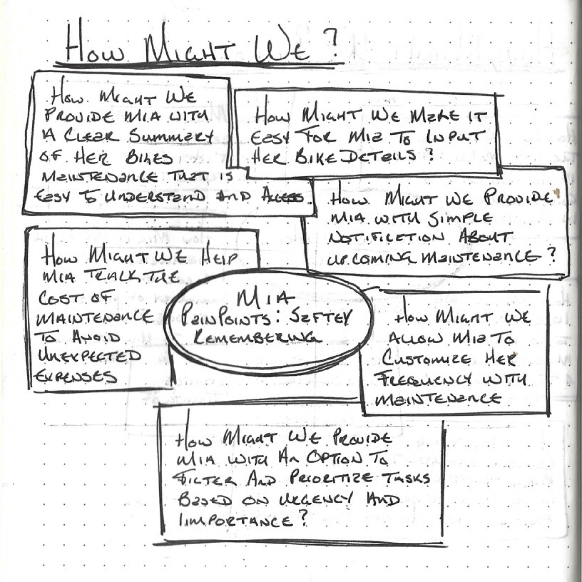
Mia: Mia is a bike enthusiast who needs a bicycle maintenance tracking app because she struggles to keep track of when her bike's maintenance tasks were last performed and when they are due again, leading to safety concerns and unexpected expenses.
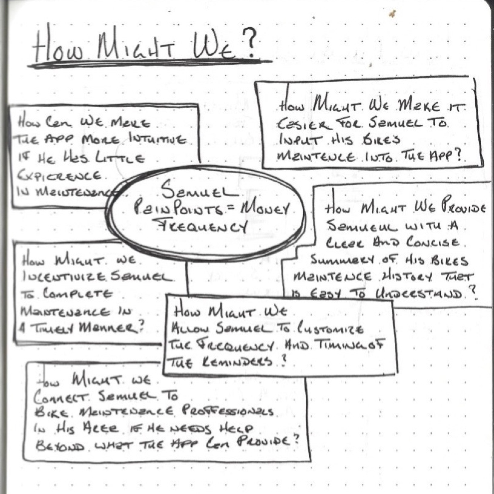
Samuel: Samuel is a busy line cook who needs an easy way to track his bicycle maintenance tasks because he struggles to remember when tasks were last performed and doesn't have enough time to perform regular maintenance. Without a convenient solution, Samuel risks putting his safety at risk while riding his bike and may end up spending more money on professional maintenance.
How Might We...
The "How Might We" (HMW) brainstorming exercise is a valuable ideation method used in the design thinking process to generate ideas and solutions for a specific problem statement. During this phase, the team formulates open-ended questions that start with "How might we" to approach the problem statement from different perspectives. The HMW questions are intentionally broad to encourage creative thinking and to stimulate new ideas.
In the case of the bicycle maintenance tracking app, the HMW questions were used to generate ideas and solutions for the needs and challenges of the user personas, Samuel and Mia. By asking questions such as "How might we make it easier for Samuel to remember his bike maintenance tasks?" and "How might we help Mia track her bike maintenance more efficiently?" the team was able to ideate and generate various potential solutions that could be developed into product features or enhancements.
Crazy Eights
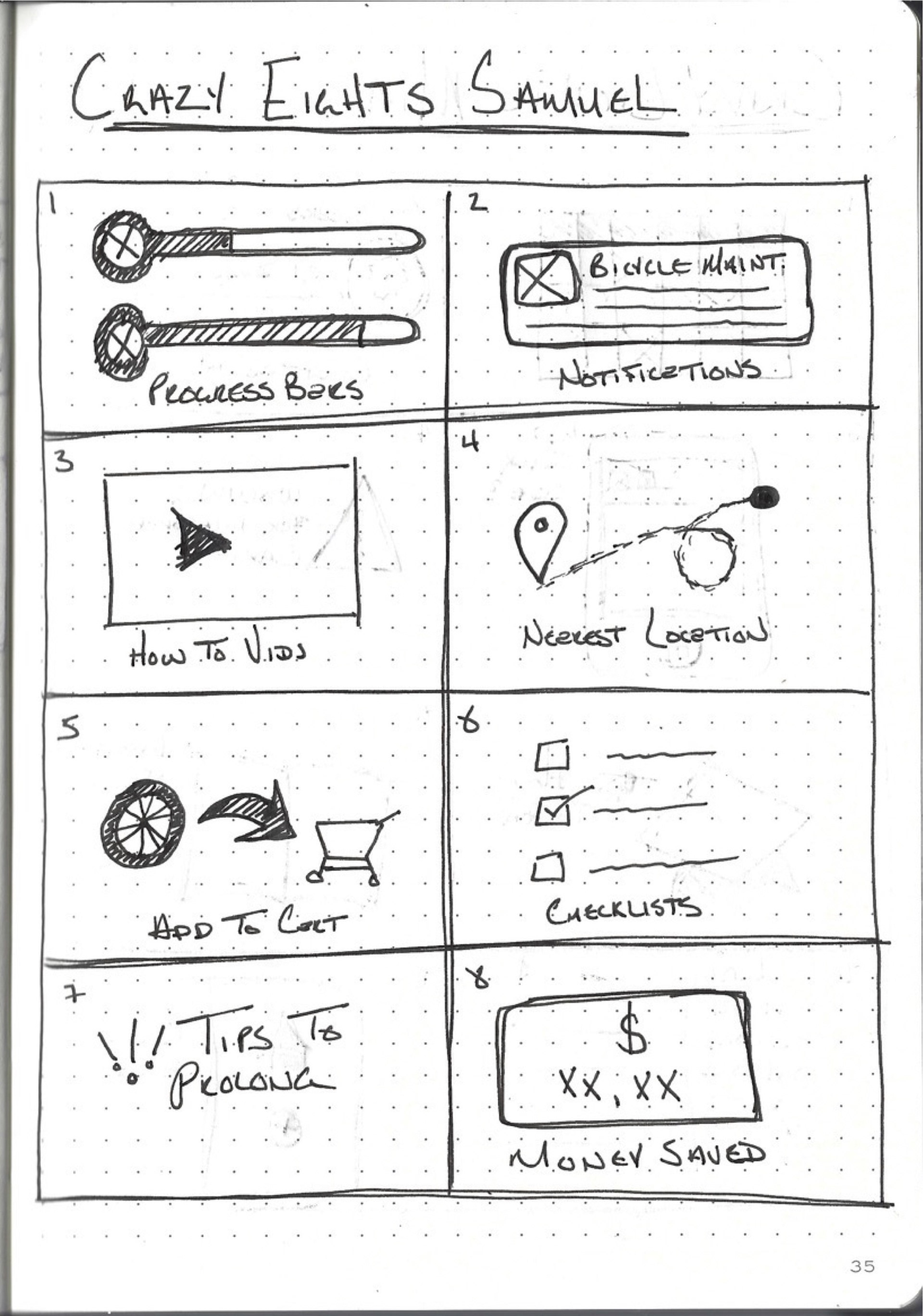
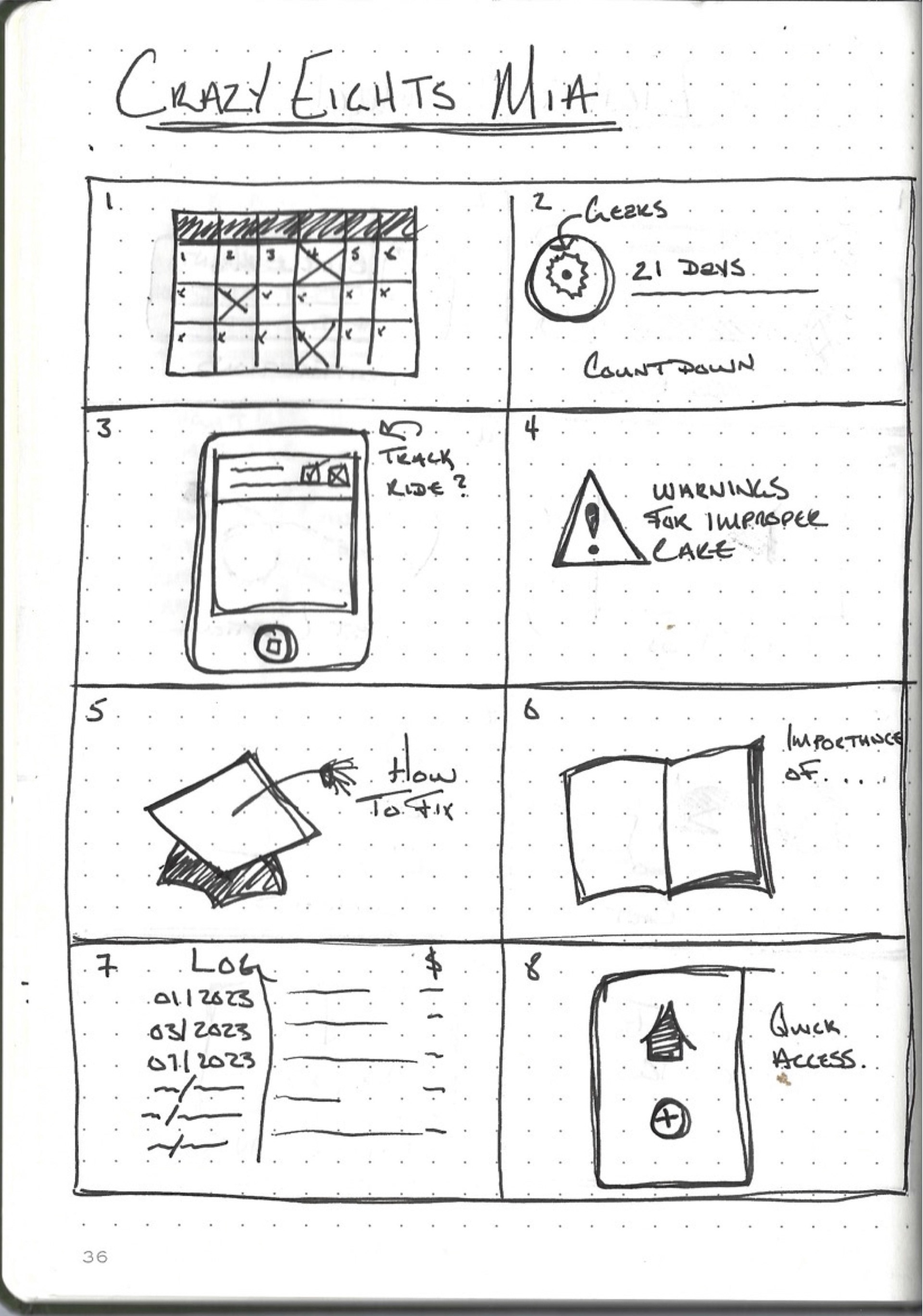
The Crazy Eights exercise is a rapid ideation technique used in the ideation phase of the design thinking process. It involves folding a piece of paper into eight equal sections and then sketching eight different ideas in each section within a limited time frame of 5-10 minutes. The goal is to generate as many ideas as possible within a short amount of time.
For this exercise, I used the Crazy Eights technique to generate eight different ideas for each of the two user personas (Samuel and Mia) in order to explore potential solutions to their problems. I focused on generating ideas that were relevant to their needs and that would provide a good user experience. This exercise helped me to think creatively and generate a range of potential solutions to the problems faced by my user personas.
Goal Statement
this bicycle maintenance tracking app is a comprehensive solution designed to help bike enthusiasts like Samuel and Mia keep track of their bike maintenance with ease. The users can effortlessly record and monitor their bike's maintenance history, set reminders for upcoming tasks, and receive personalized recommendations for optimal maintenance. The app aims to alleviate the inconvenience, safety risks, and unexpected expenses associated with neglected maintenance. By providing a reliable and user-friendly solution, our app aims to positively impact users by reducing the risk of accidents, saving them time and money, and allowing them to ride with peace of mind. To measure the effectiveness of the app, the app will closely monitor user engagement, user satisfaction, and the frequency of maintenance tasks performed on time. The goal is to continuously improve the app and provide an exceptional user experience that meets the needs of all users.
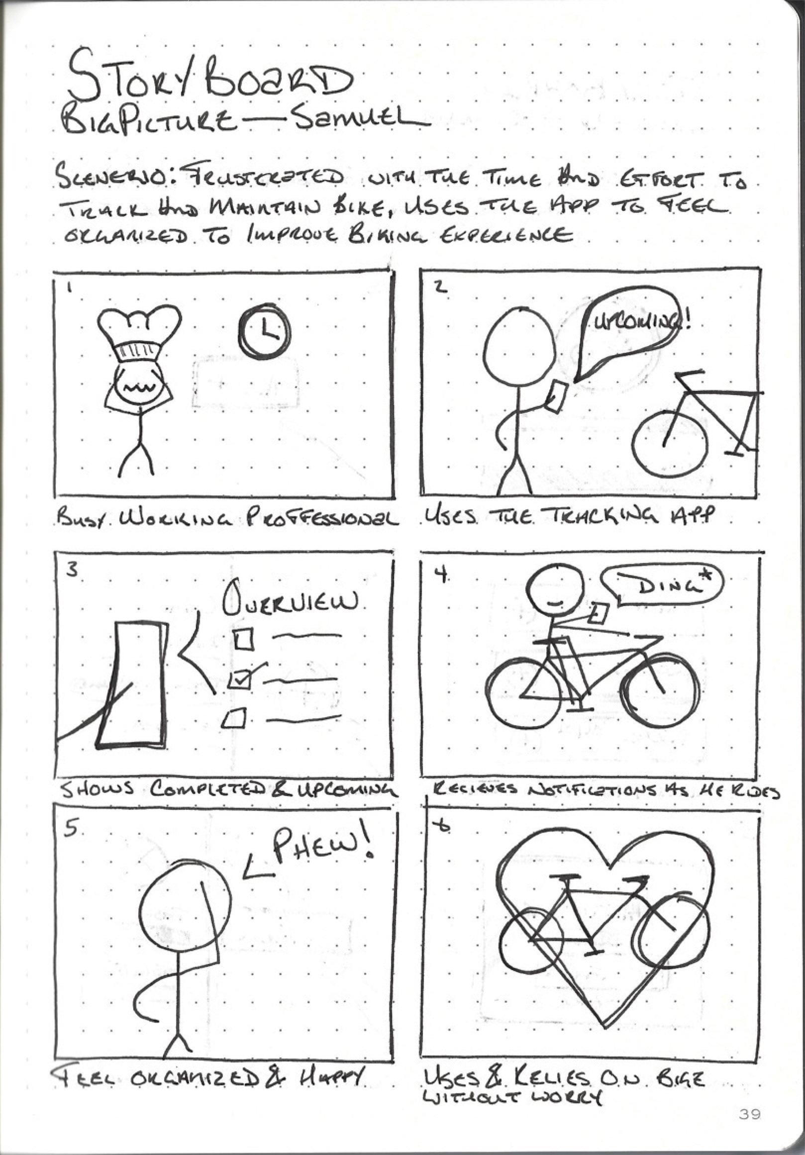
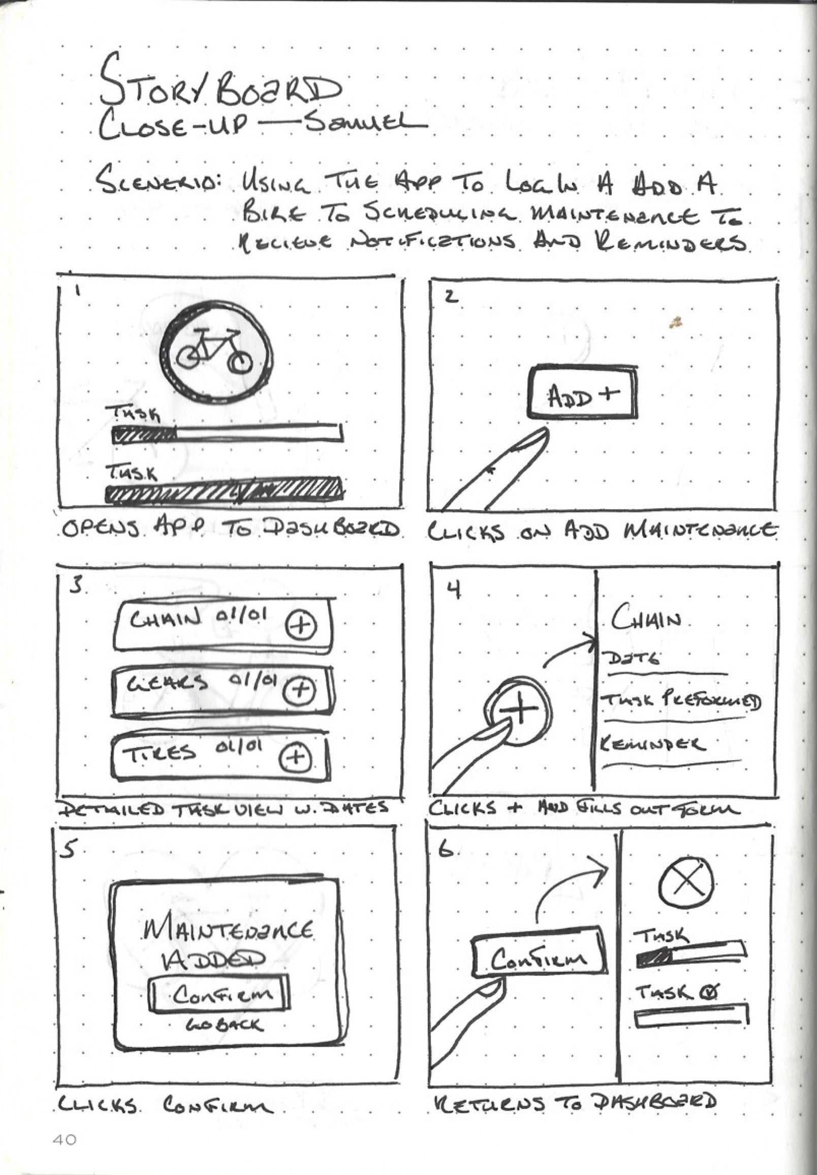
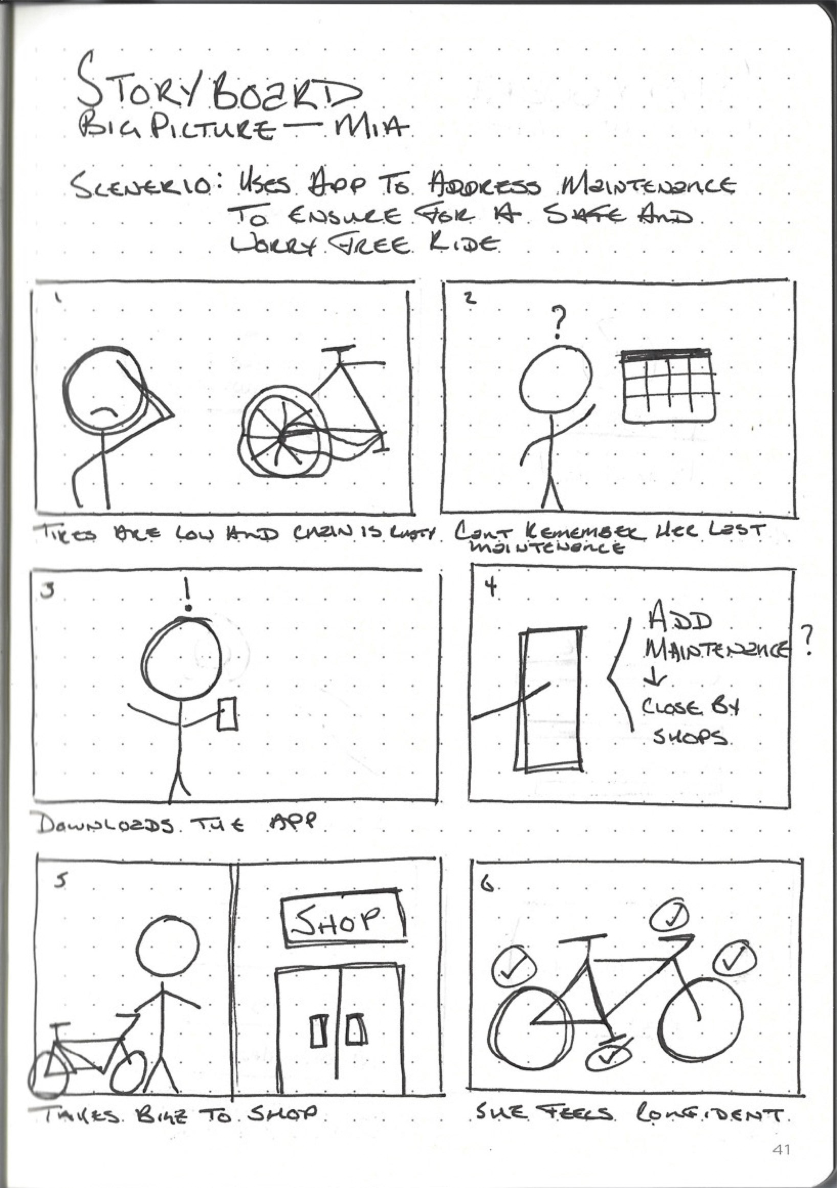
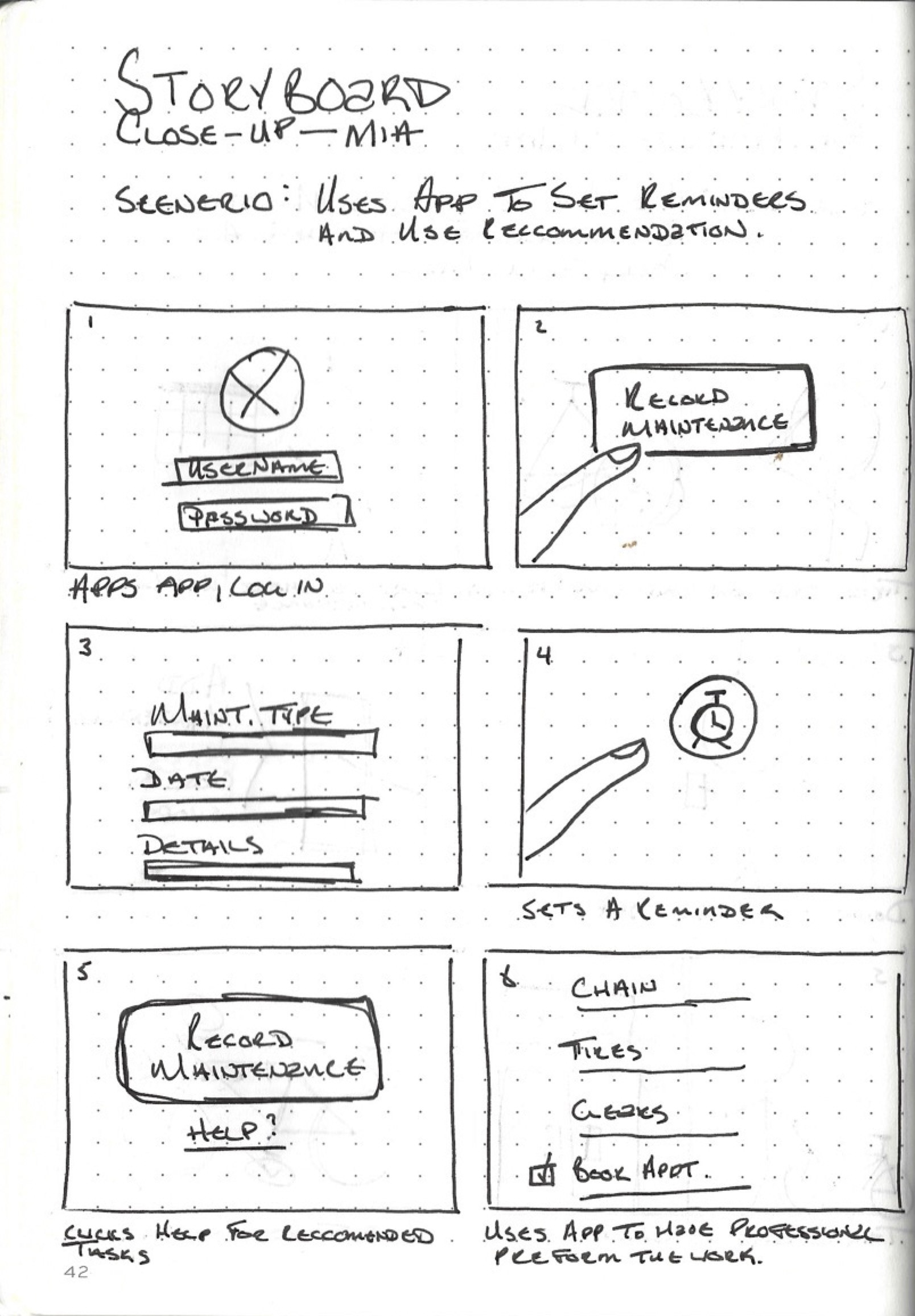
Storyboarding
As a UX designer, storyboards are essential in showcasing the significance of my user personas, Mia and Samuel, for my Google UX Design Certificate project on the bicycle maintenance tracking app. By visually depicting their journey with the app, I can effectively communicate their pain points, needs, and how the app addresses them, demonstrating my user-centered design approach and the app's value to potential employers or clients visiting my portfolio website.
4. Prototype
Paper to Digital Wireframes
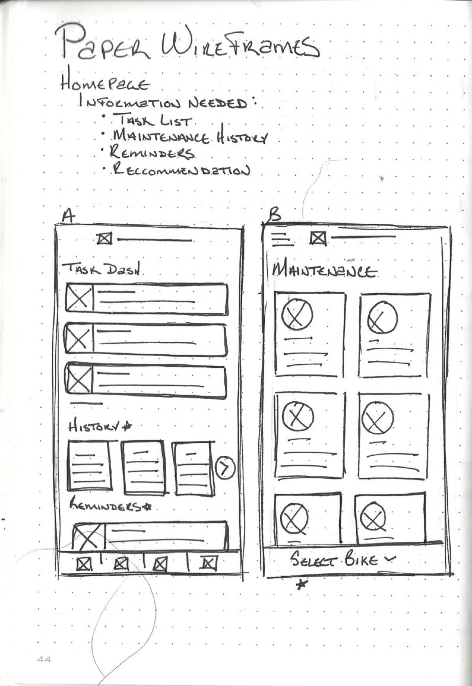
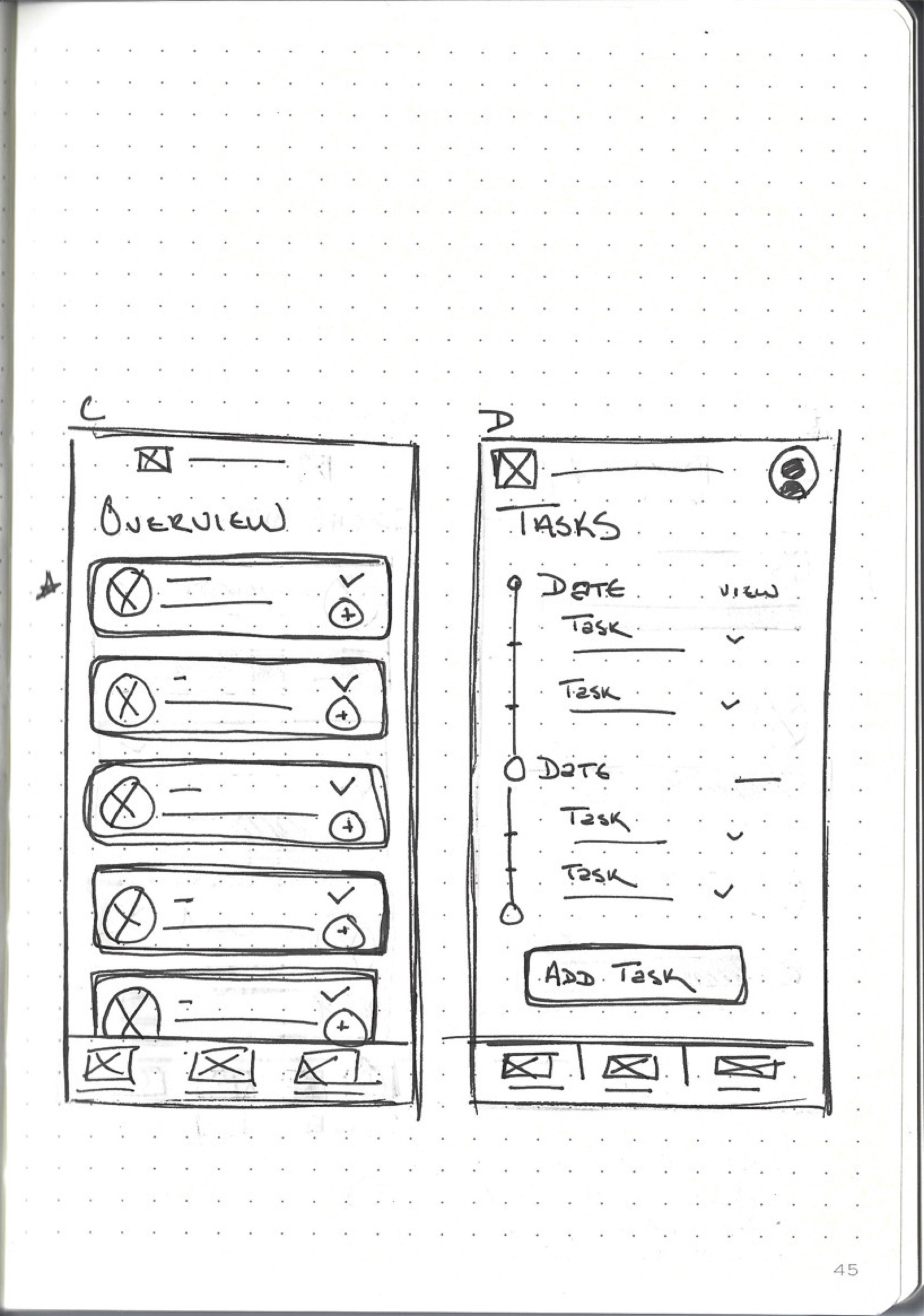
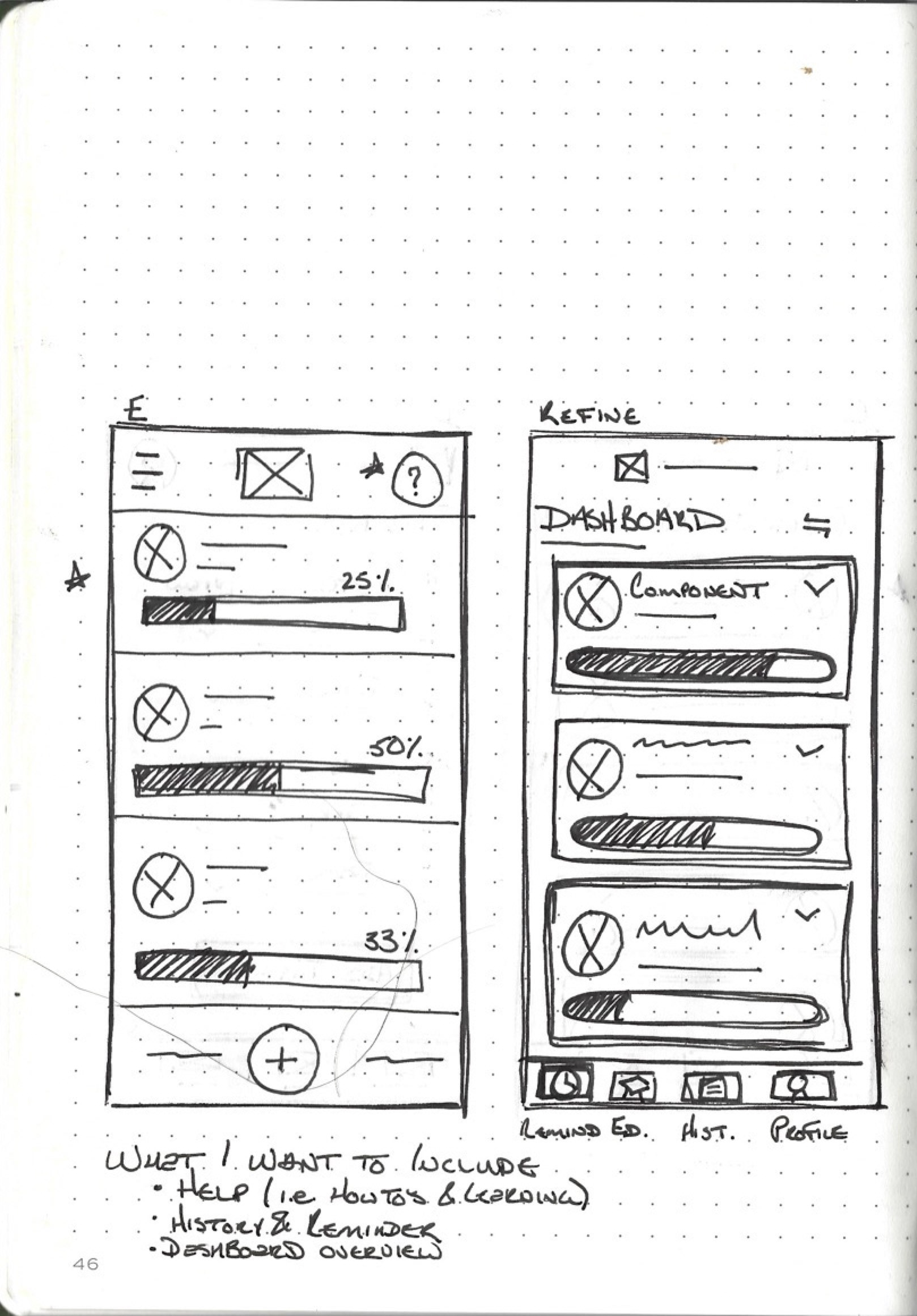
Wireframing is a critical part of the ideation and ultimately the prototyping phase of the design thinking framework. As I design my bicycle maintenance app, wireframes helped me to visualize and iterate on the structure and layout of the app. They allowed me to focus on the information architecture, content placement, and user flow, ensuring that the overall user experience aligns with the app's objectives and user needs. By creating wireframes, I can test different design ideas and gather feedback from stakeholders and users early on, reducing the risk of costly revisions later in the process.
Paper Wireframes: When it comes to wireframing, paper wireframes have proven to be quick and effective tools. As I sketch my ideas using pen and paper, I can rapidly iterate and communicate my design concepts. Paper wireframes encourage a low-fidelity approach, prioritizing the structure and layout over visual details. They are versatile, portable, and easy to modify, making collaborative discussions and quick design iterations a breeze. With paper wireframes, I can focus on core functionality, user flows, and information hierarchy, keeping the user experience at the forefront without getting distracted by visual design elements.
Digital Wireframes: Moving from paper to digital wireframing is essential to inform the prototyping phase of my design process. I used Figma which allowed me to translate my wireframes into interactive prototypes. Digital wireframes provide more precise layout and alignment, allowing me to include UI components and elements. With basic interactions and transitions, I can create a more realistic representation of the final product and simulate the user experience more accurately. The digital format also facilitates easy sharing, collaboration, and version control, enabling me to gather feedback and iterate on designs seamlessly. Digital wireframes bridge the gap between wireframes and high-fidelity prototypes, empowering me to make informed decisions about the app's functionality and user interactions.

Low-Fidelity Prototypes
Low-fidelity prototyping helped me create usable user flows for my bicycle maintenance app. By translating my wireframes into low-fidelity prototypes, I can simulate the user experience and validate the app's functionality and interactions. With low-fidelity prototypes, I can quickly iterate on the user flows and test different paths and interactions. By using simple shapes, placeholders, and limited interactivity, I can focus on the core functionalities and ensure that the app's user flows are intuitive and efficient. Through user testing and feedback, I can identify pain points, bottlenecks, or areas of confusion within the user flow and make necessary refinements. By sharing the prototypes, I can facilitate discussions and gather feedback on the overall user experience, identify any usability issues, and incorporate suggestions for improvement. Low-fidelity prototypes also allow me to gather valuable insights from stakeholders and potential users early in the design process which will be discussed in the test phase of the design thinking framework.
5. Test
UX Research Plan
The UX research plan for the CycleCare Bicycle Maintenance App involved defining clear research objectives and identifying the target audience, which in this case were cyclists of various backgrounds, skill levels, and preferences. The research methodology included qualitative research methods such as interviews, surveys, and contextual inquiries to gather insights about cyclists' pain points, behaviours, and needs related to bike maintenance. This research plan ensured a user-centered approach throughout the design process.
Usability Study
The usability study conducted for the CycleCare app aimed to evaluate its effectiveness and ease of use. Participants representing the target audience were recruited, and specific tasks were assigned for them to perform within the app. By observing participants' interactions, collecting their feedback, and measuring task completion rates and efficiency, valuable insights into usability issues and areas of improvement were obtained. This usability study helped identify pain points, validate design decisions, and iterate on the app's interface to enhance user satisfaction and overall usability.
Observations Into Insights
Throughout the usability study and design process, careful observations of participants' behaviours and reactions were made. These observations provided valuable insights that informed design decisions and uncovered underlying user needs. For example, observations of participants struggling with maintenance tracking complexity led to the simplification of the process and the incorporation of actionable steps. Additionally, noting participants' preferences for reminder customization and resource accessibility guided the inclusion of flexible options and a comprehensive resource hub in the app. These observations translated into insights that drove design iterations and ensured that the CycleCare app effectively addressed the identified challenges.
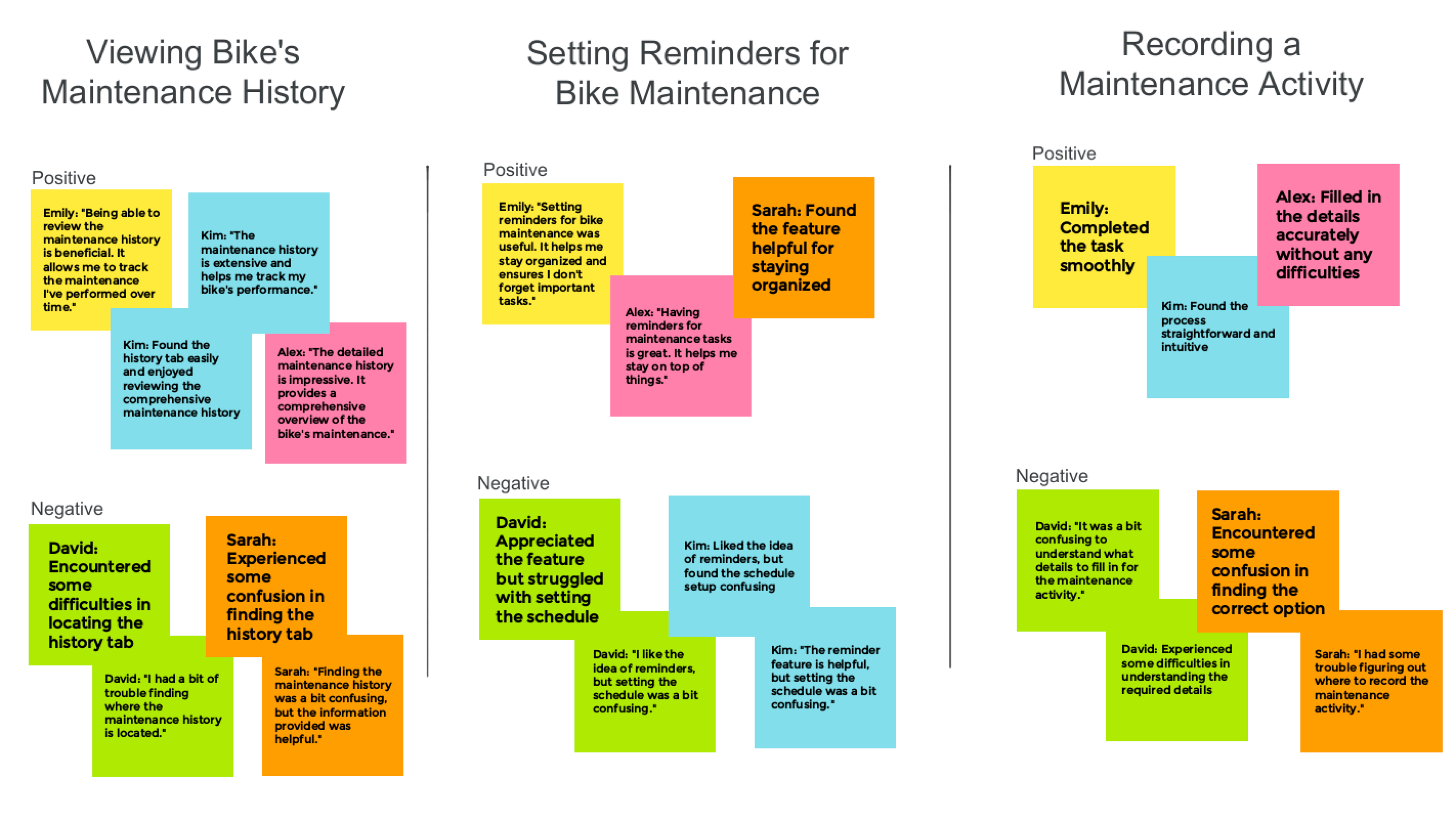
Observation Affinity Diagram
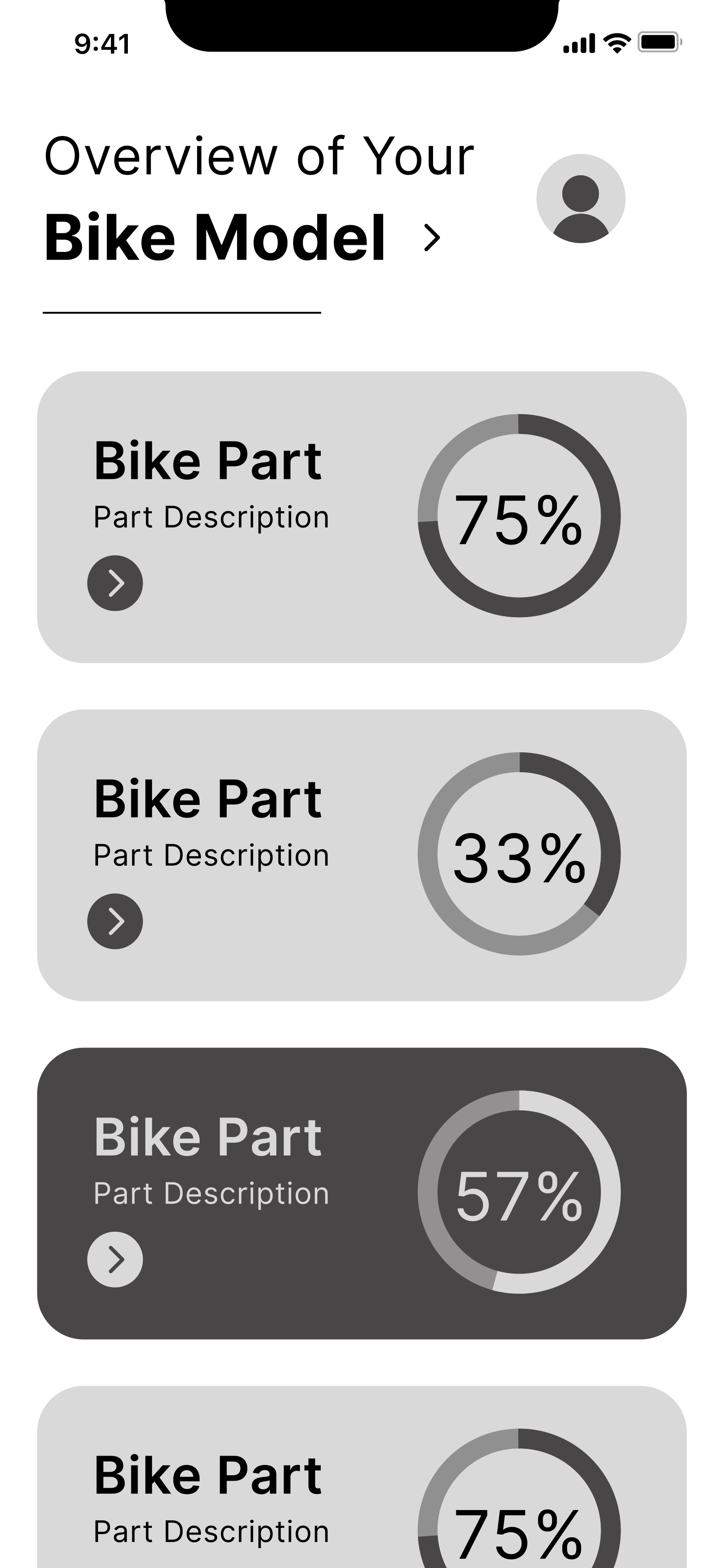
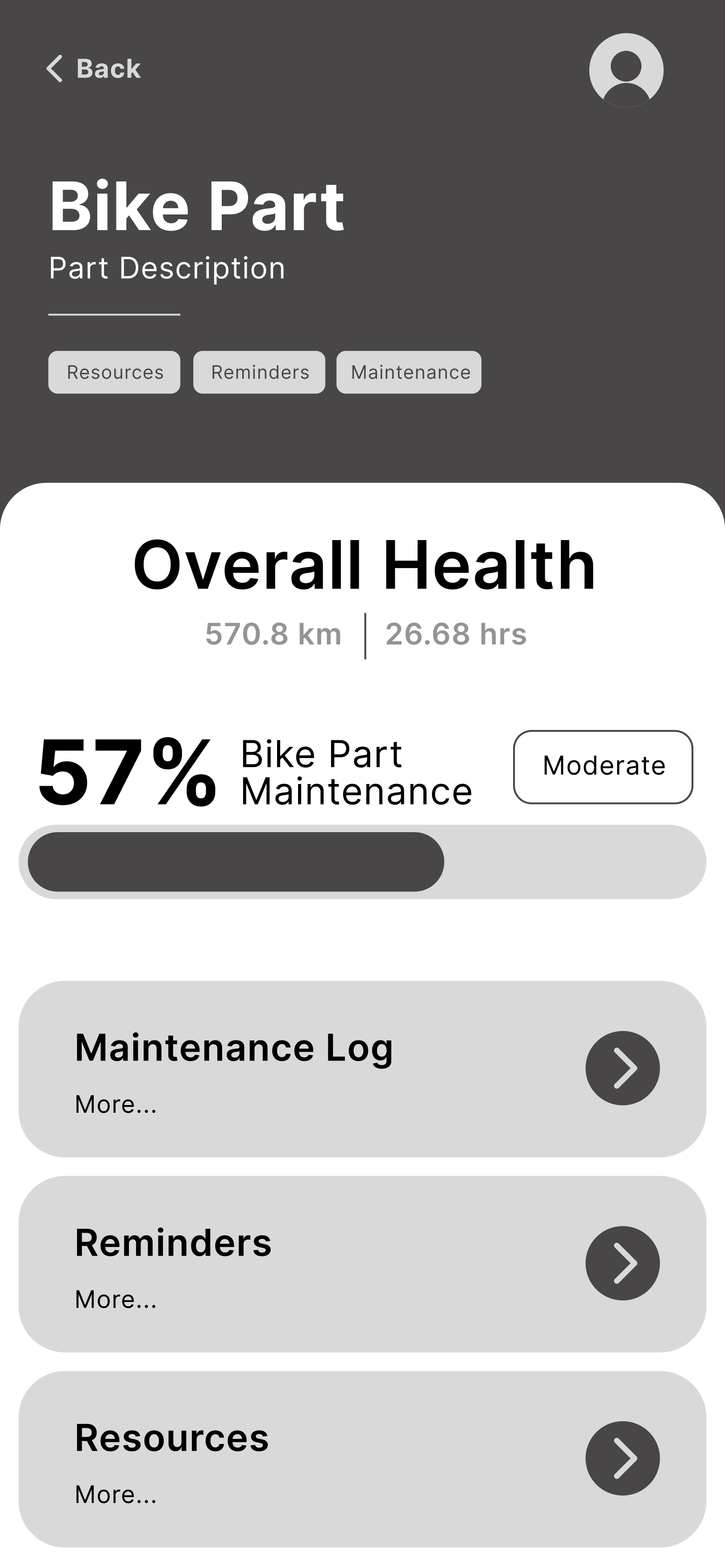
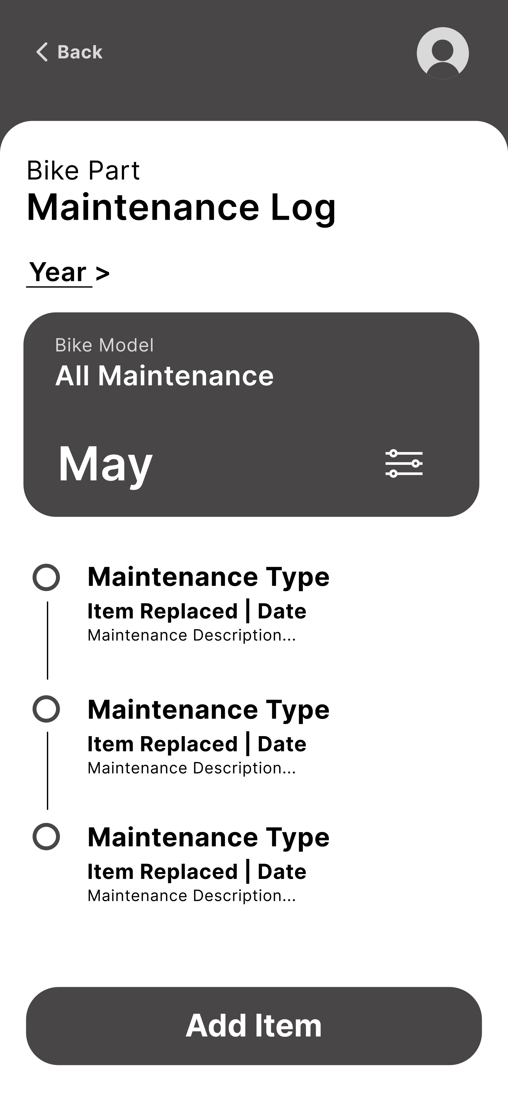
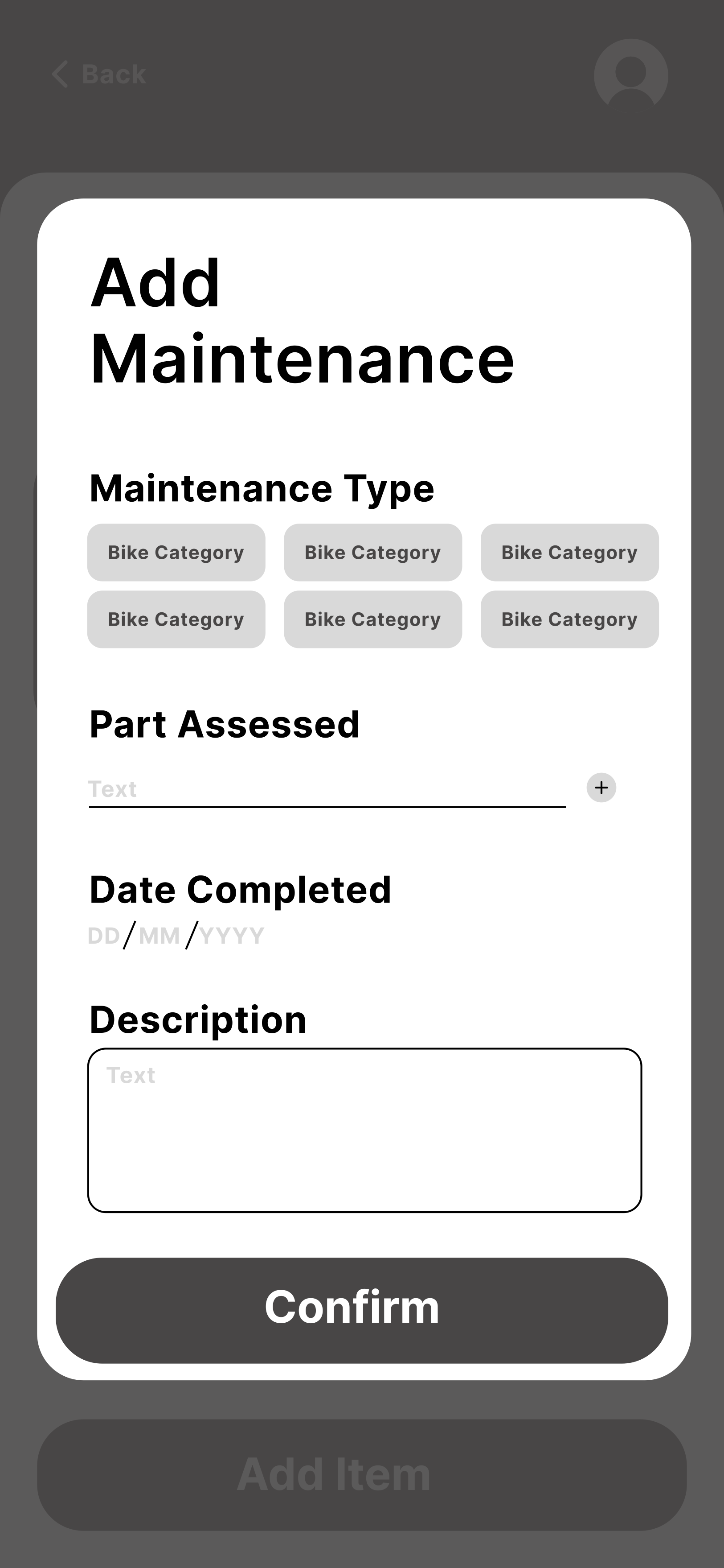
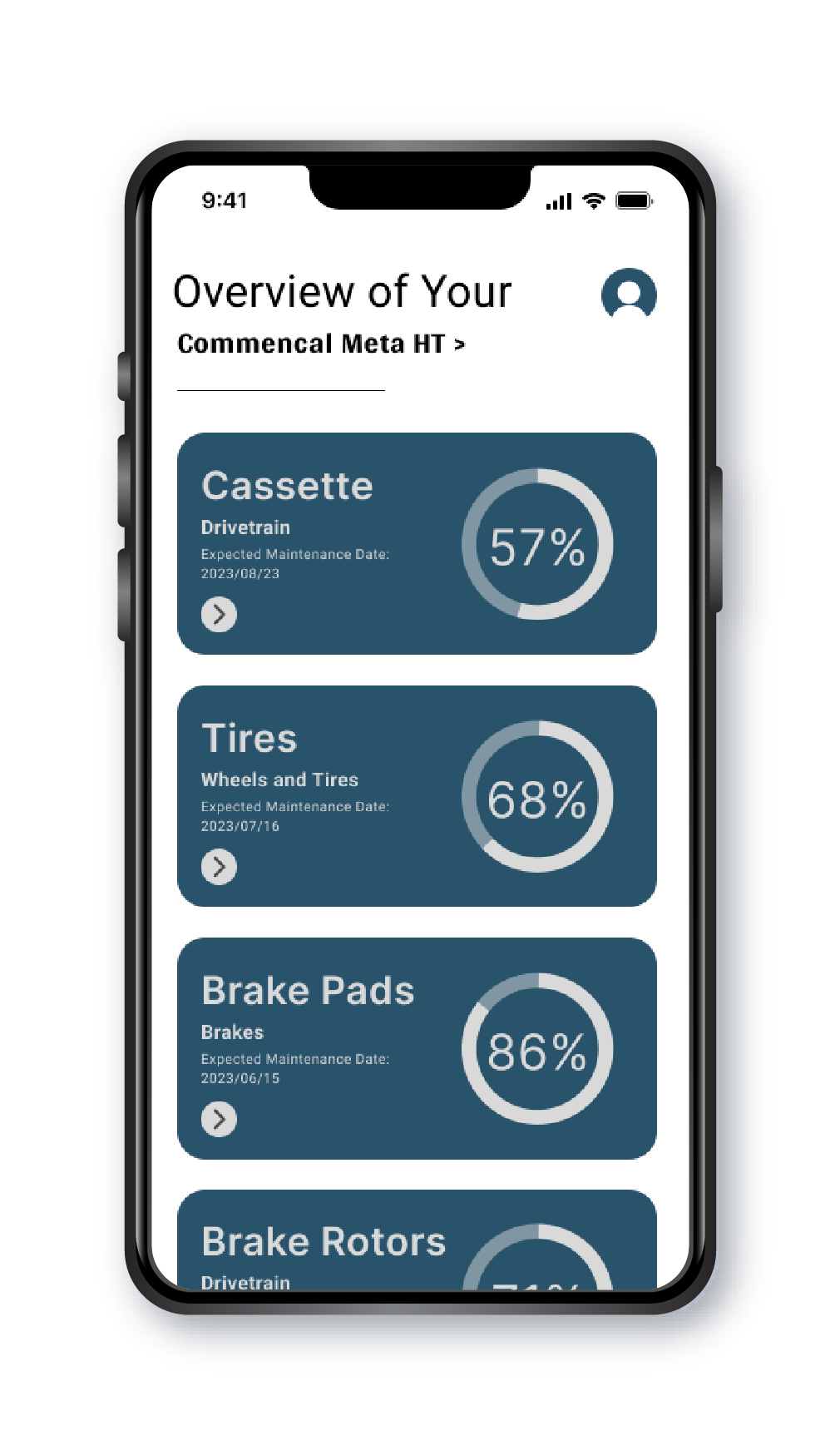
Final Designs
During the testing phase, I used the valuable insights gathered from user testing to create high fidelity prototypes for CycleCare. The feedback received during usability testing sessions allowed me to identify areas of improvement and refine the app's design. By incorporating user suggestions, addressing pain points, and iterating on the prototypes, I was able to create a user interface that effectively addressed the challenges identified in the case study.
Challenge One
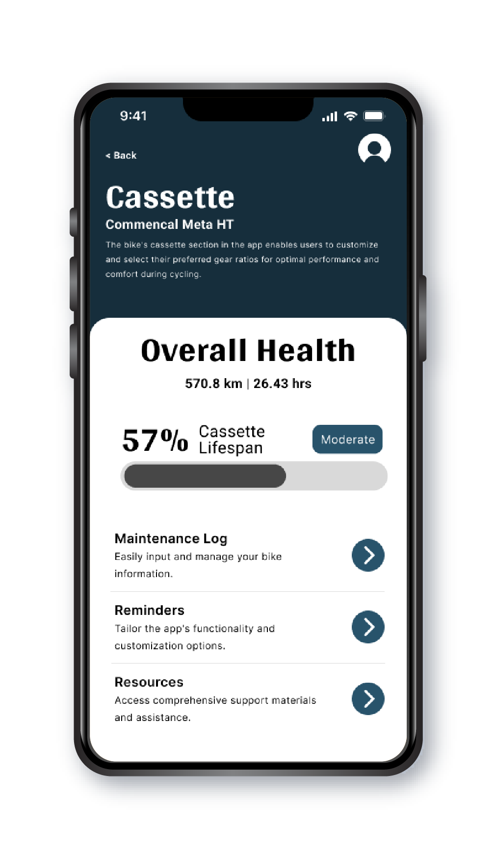
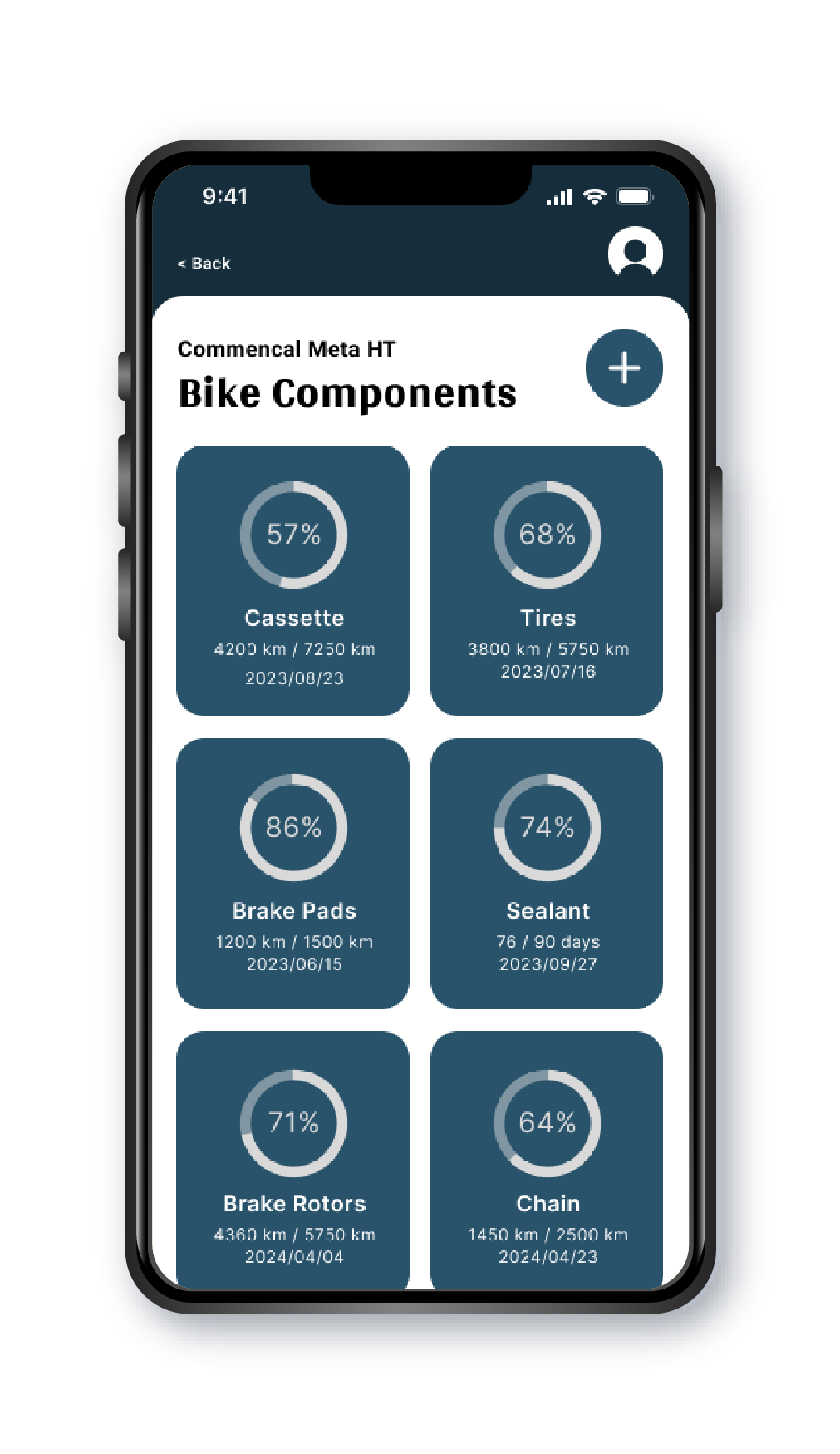
Maintenance Tracking Complexity
To simplify the process of tracking and managing bicycle maintenance tasks, I developed a streamlined and intuitive user interface. The app allows cyclists to easily input service intervals and component-specific requirements, ensuring that they have a clear overview of their maintenance needs. By breaking down complex tasks into simple, actionable steps, cyclists can easily track their maintenance progress and ensure that their bikes are in optimal condition.
Challenge Two
Reminder Customization
Flexibility in reminder customization was achieved by incorporating user preferences for mileage or time-based notifications. Cyclists can easily set their own preferences within the app, receiving timely reminders for servicing, part replacements, and routine inspections. This customization feature empowers cyclists to align reminders with their specific riding habits and maintenance routines, ensuring that they never miss a crucial maintenance task.
Challenge Three
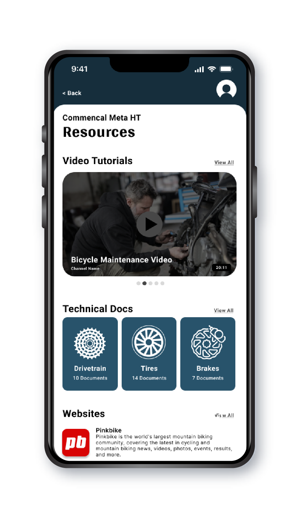
Resource Accessibility
Access to a comprehensive library of reliable information was prioritized to empower cyclists with accurate resources for bike maintenance and repairs. By curating a diverse collection of guides, videos, and tutorials, the app provides cyclists with easy access to the information they need to confidently tackle maintenance tasks. This comprehensive resource hub ensures that cyclists can find the guidance they need, regardless of their level of expertise.
Challenge Four
User-Friendly Interface
Creating an intuitive and user-friendly interface was a primary focus to ensure that cyclists of all technical backgrounds could navigate the app effortlessly. By following design principles such as clear navigation, logical information hierarchy, and visual cues, I crafted an interface that guides users through the app seamlessly. This user-centric approach reduces friction and eliminates confusion, enabling cyclists to input data, schedule reminders, and access relevant information with ease.
Takeaways
CycleCare is the culmination of the relentless pursuit to simplify bike maintenance and enhance the cycling experience. Throughout this journey, I have placed the user at the forefront, embracing their feedback and aspirations to create an app that truly empowers cyclists like myself.
With customizable reminders and a comprehensive resource hub, CycleCare ensures that each cyclist can personalize their maintenance schedule and access reliable information with ease. Through iterative prototyping and continuous improvement, I have crafted an intuitive interface that minimizes friction and maximizes engagement, making it effortless for cyclists of all skill levels to navigate and utilize the app.
As the prototype of CycleCare evolves, I envision integrating smart device technology and fostering a vibrant community of like-minded cycling enthusiasts, further enhancing the app's capabilities and providing a platform for shared experiences and knowledge.
CycleCare began as a way to transform the way we approach bike maintenance, and ultimately, enhance the joy and performance of each ride. Together, we can unlock the full potential of our cycling adventures.